Year: 2022
Branding
Studio Dentistico
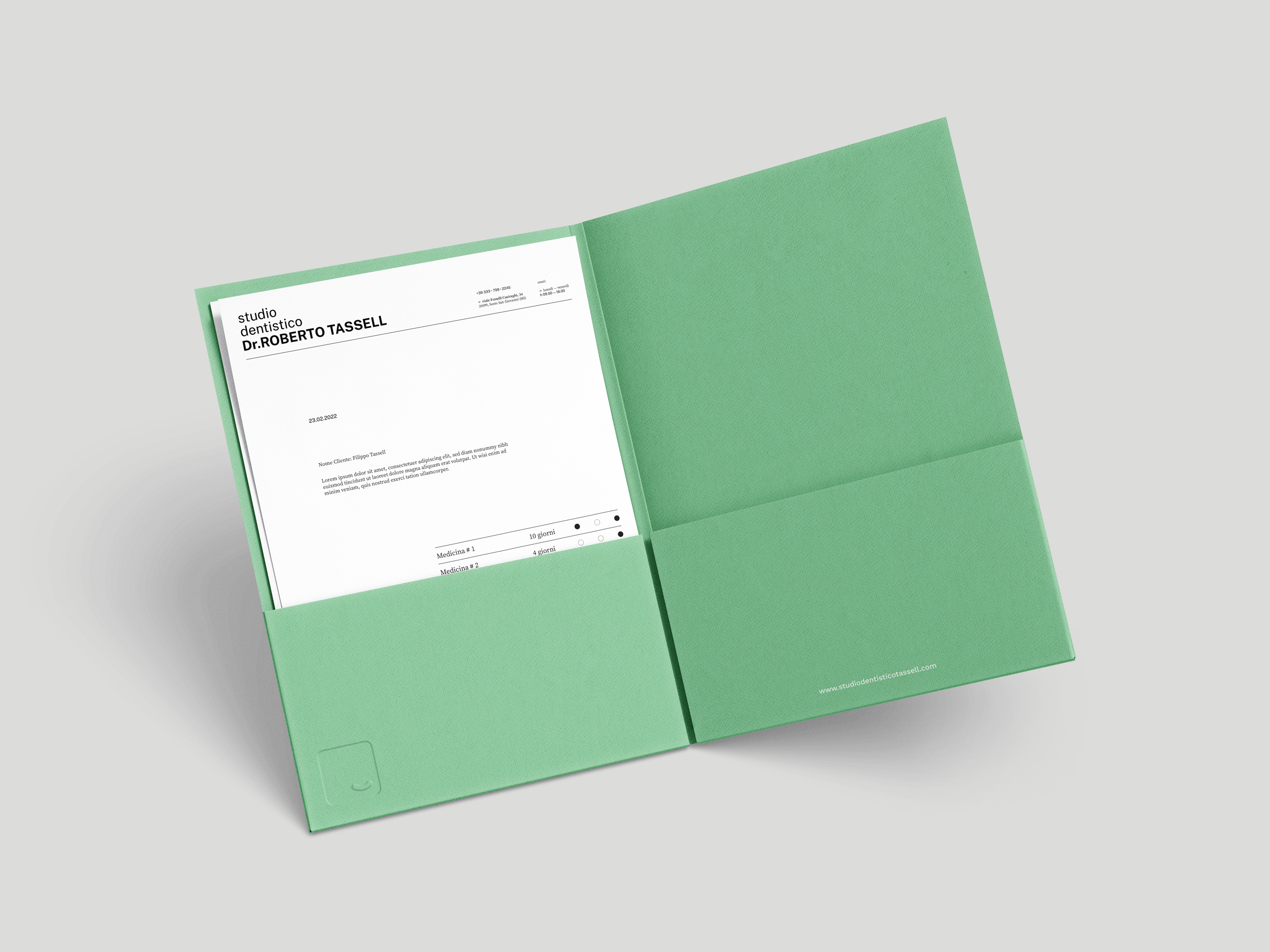
This branding project was for an established dentist Dr.Roberto Tassell, who after many years of working as a consultant in various studios wanted to open a studio of his own. The concept was to give the studio a positive and happy identity rather than something clinical and cold. The doctor himself has a sunny and welcoming attitude, which he wanted reflected in the visual language.
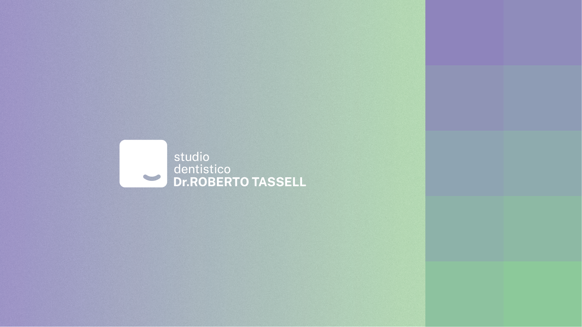
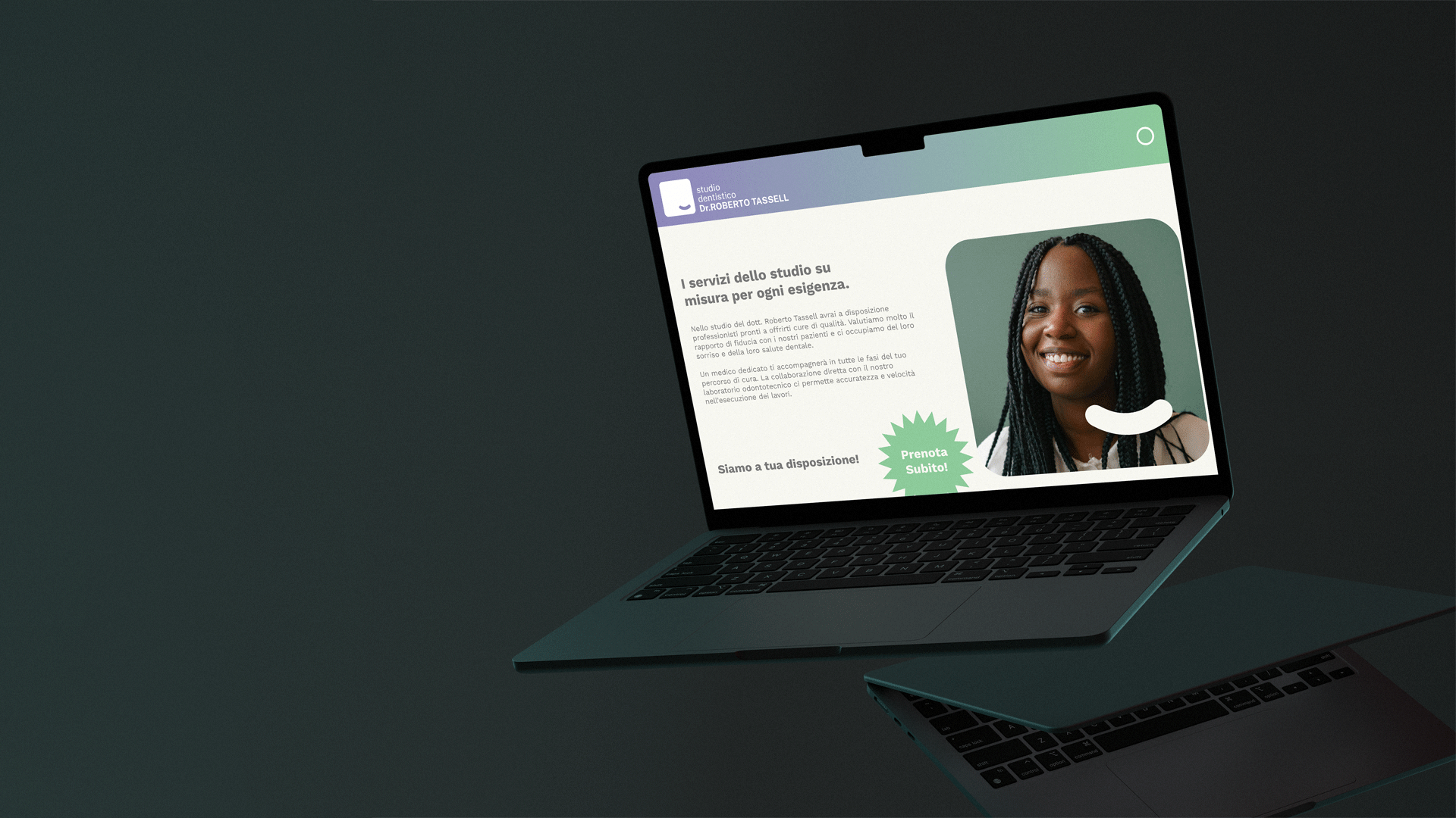
The logo was designed to depict a smile instead of a tooth or a symbol more generically used in the field of dentistry. Along with the choice of colours and the crisp but friendly typography, the brand as a whole has a young and accessible image.
This branding project was for an established dentist Dr.Roberto Tassell, who after many years of working as a consultant in various studios wanted to open a studio of his own. The concept was to give the studio a positive and happy identity rather than something clinical and cold. The doctor himself has a sunny and welcoming attitude, which he wanted reflected in the visual language.
The logo was designed to depict a smile instead of a tooth or a symbol more generically used in the field of dentistry. Along with the choice of colours and the crisp but friendly typography, the brand as a whole has a young and accessible image.